2 Plot
2.1 Boxplot
Both wide matrix and long matrix data can be used to draw boxplot. In the demo1, we used the gene expression table in different samples with long matrix format and the metadata table of samples.
In the drawing parameters:
Specify the x-axis to display group information by selecting the option of
conditionsin theX-axis variableparameter;Specify the y-axis to display the expression of genes in different samples by selecting the option of
ENSG00000109689in theY-axis variableparameter;Add lines of the paired samples in the two groups by selecting the option of
individualin theGroup variable for lining pointsparameter;Use the color set “Set3” to color the boxes of two groups by selecting the option of
Set3in theManual color vector (color set)parameter;The
Do statistics significane test for each groupparameter is selected asyesso that a letter is added to the top of the box to show whether the gene is significantly different between the two groups.

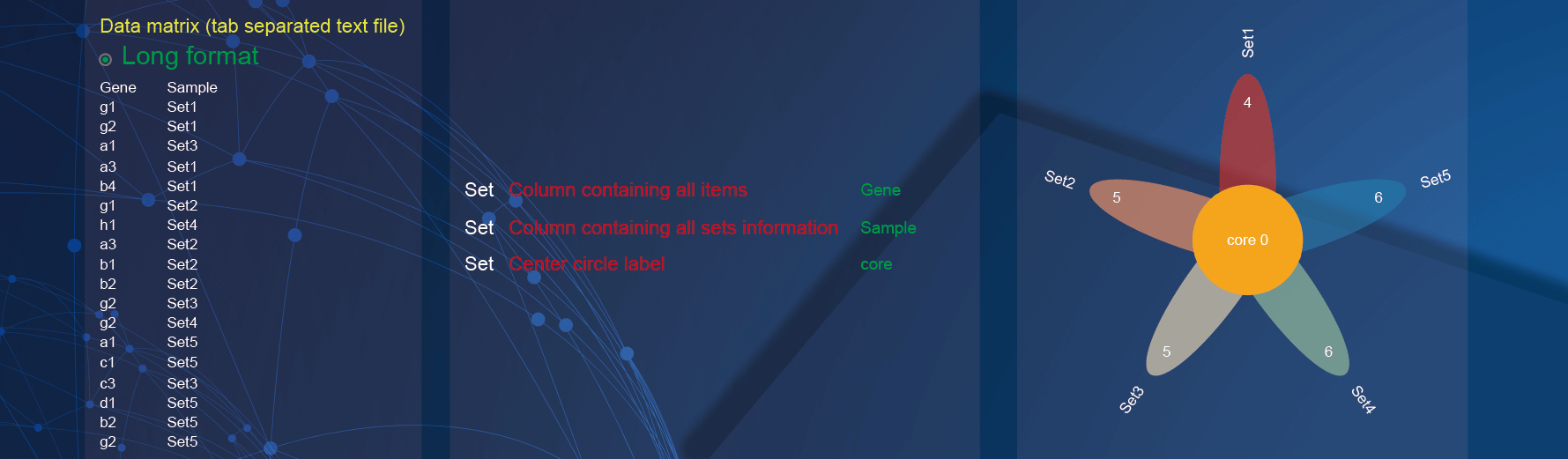
2.2 Flower
In the demo1, paste two-column matrix with the sample information of genes.
In the drawing parameters:
Specify the column containing genes by selecting the option of
Genein theColumn containing all itemsparameter;Specify the column containing sample information by selecting the option of
Samplein theColumn containing all sets informationparameter;Change the label of the center circle which reflecting the number of common genes of all samples by inputting
corein the textarea ofCenter circle labelparameter.
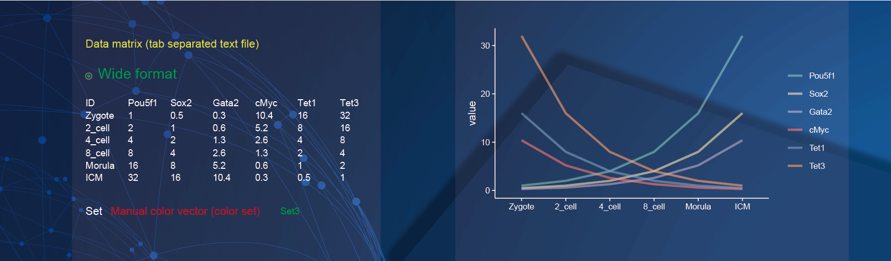
2.3 Line plot
Both wide matrix and long matrix data can be used to draw line plot. In the demo1, we used the gene expression table in different samples with wide matrix format.
In the drawing parameters:
- Use the color set “Set3” to color the lines of genes by selecting the option of
Set3in theManual color vector (color set)parameter.
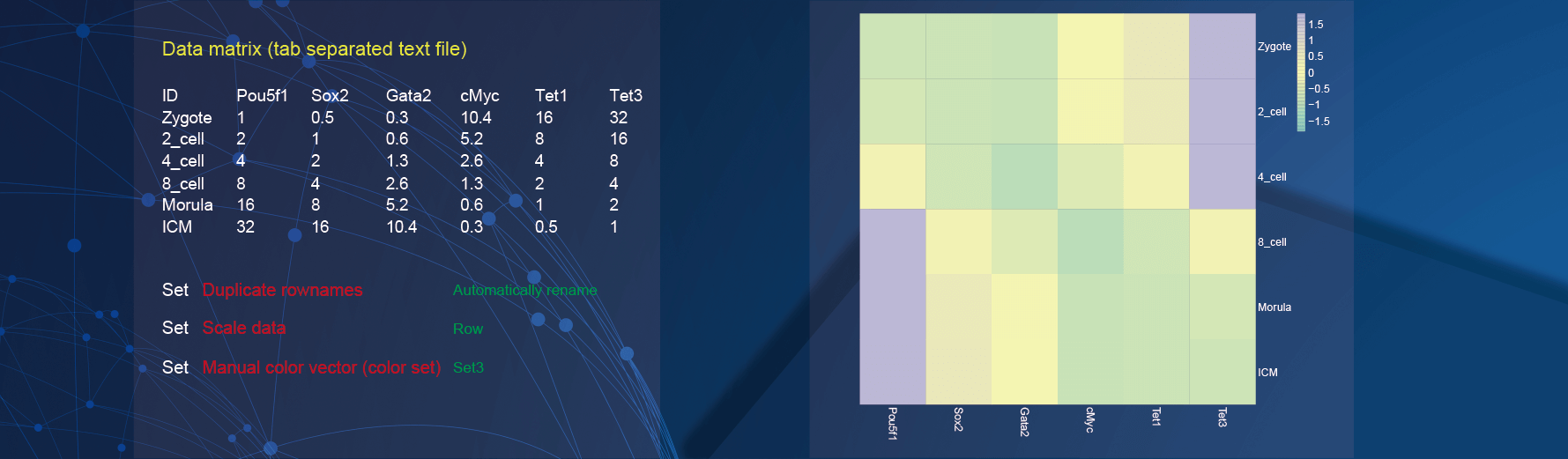
2.4 Pretty heatmap
In the demo1, we used the common gene expression profile which contains the expression of genes in different samples.
In the drawing parameters:
The
Duplicate rownamesparameter is selected asAutomatically renameto deal with duplicate row names of data;The
Scale dataparameter is selected asRawto scale the rows of data for clustering and visualization;Use the color set “Set3” to color the lines of genes by selecting the option of
Set3in theManual color vector (color set)parameter.
2.5 Volcano plot
In the demo1, we used the different gene analysis result incluing all gene name, the mean of gene expression between the two groups, log2 fold change of gene expression in the two groups, statistical significance results, some interesting gene names, and the information whether the gene is different between the two groups.
In the drawing parameters:
Specify the name of the column whose value is log2 fold change of gene expression in the two groups by selecting the option of
log2FoldChangein theFold change columnparameter;Specify the name of the column whose value is statistical significance results by selecting the option of
padjin theStatistical significance columnparameter;The
Log10 transform significance valueparameter is selected asLog 10 transformto transform log10 on the statistical significance results;Specify the name of the column whose value is the information whether the gene is different in the two groups by selecting the option of
Levelin theGene expression change status variableparameter;After selecting the option of
Levelin theGene expression change status variableparameter, the order of variables in thelevelcan be set by selecting the order of the options of theStatus variable orderparameter;Change the color transparency of points by inputting
0.4in the textarea ofColor transparencyparameter;Add the horizontal lines to show the significance threshold by inputting
fdrin the textarea ofHorizontal line positionsparameter;Add the horizontal and vertical lines to show the threshold of significance and log2 fold change by inputting
0.05,1in the textarea ofDE genes filtering thresholdparameter. And ifGene expression change status variableparameter is empty, the parameter will automatically determine which genes are the different between the two groups based on the provided thresholds.

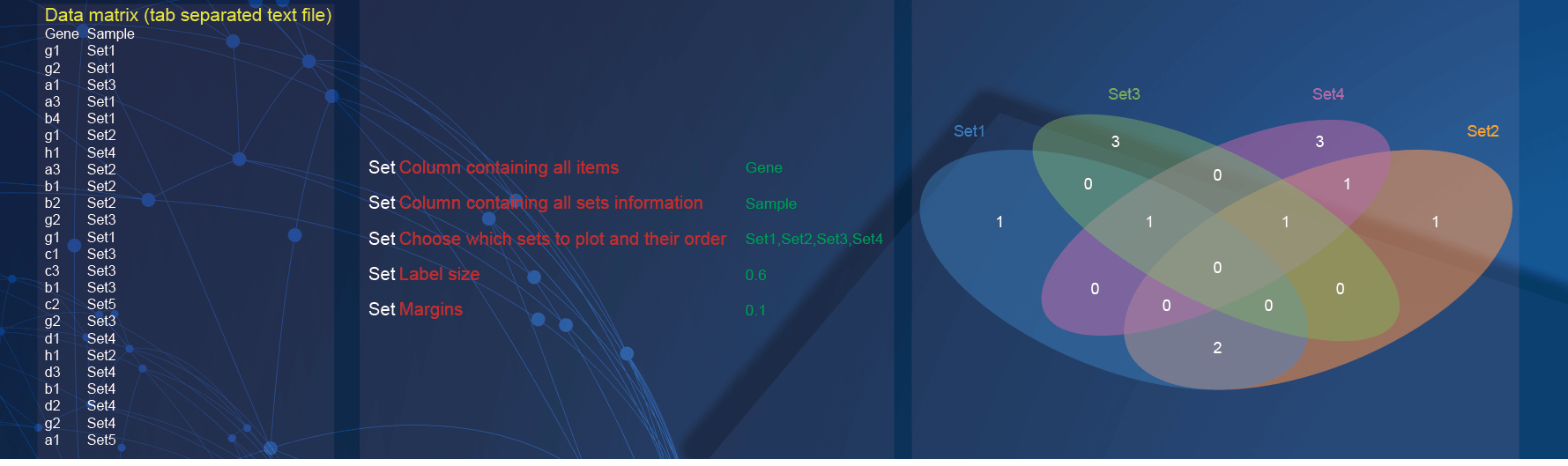
2.6 VennDiagram plot
In the demo1, paste two-column matrix with the sample information of genes.
In the drawing parameters:
Specify the column containing genes by selecting the option of
Genein theColumn containing all itemsparameter;Specify the column containing sample information by selecting the option of
Samplein theColumn containing all sets informationparameter;Samples of interest and order of presentation can be set by selecting
Set1, Set2, Set3, Set4(multiple options in order) of theChoose which sets to plot and their orderparameter;Change the label size by inputting
0.6in the textarea ofLabel sizeparameter;Change the blank range around the diagram by inputting
0.1in the textarea ofMarginsparameter.
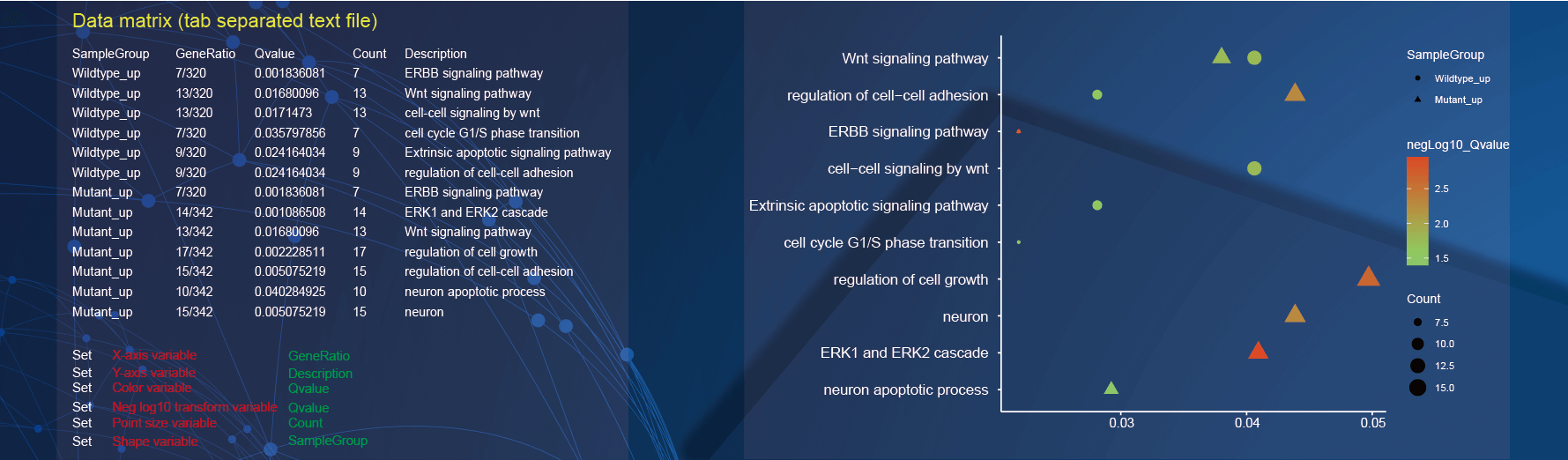
2.7 Enrichment plot
In the demo1, paste four-column matrix with the group information, GeneRatio, statistical significance results, the number of genes of GO terms, and the description of GO terms.
In the drawing parameters:
Specify the x-axis to display GeneRatio by selecting the option of
geneRatioin theX-axis variableparameter;Specify the y-axis to display the description of GO terms by selecting the option of
Descriptionin theY-axis variableparameter;Specify the color of points to display the statistical significance results by selecting the option of
Qvaluein theColor variableparameter;Neg log10 transform statistical significance results by selecting the option of
Qvaluein theNeg log10 transform variableparameter;Specify the size of points to display the number of genes of GO terms by selecting the option of
Countin thePoint size variableparameter;Specify the shape of points to display the group information by selecting the option of
SampleGroupin theShape variableparameter.
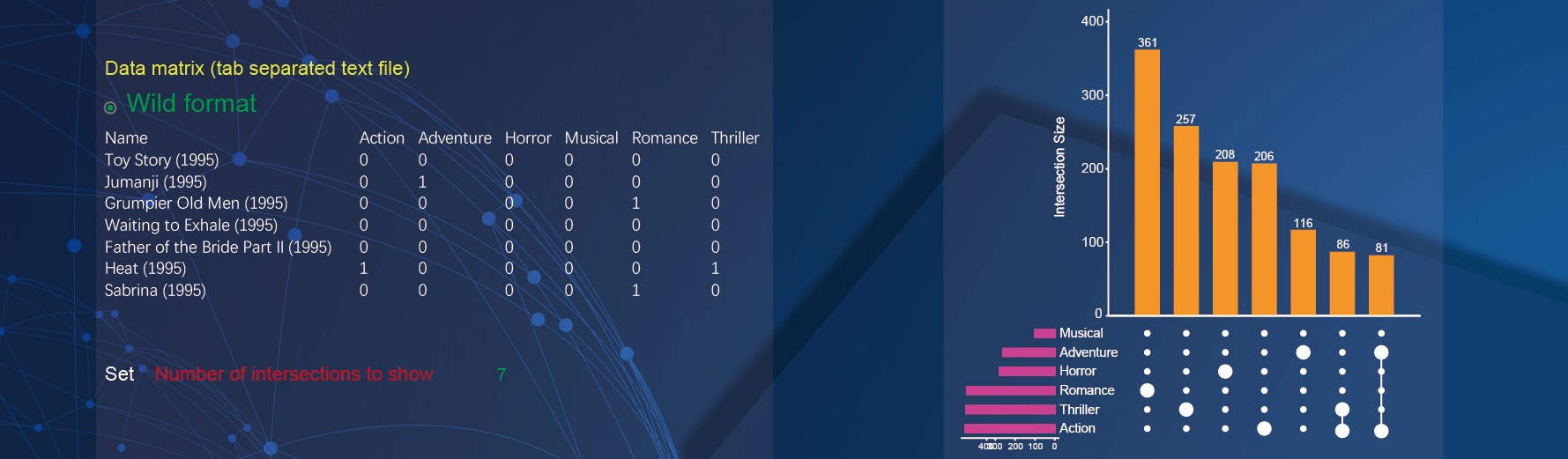
2.8 Upsetview plot
Both wide matrix and long matrix with header data can be used to draw upsetview plot. In the demo1, paste wide matrix containing the name of movies and the style of movies.
In the drawing parameters:
- Specify the threshold of intersections to plot by inputting
7in the textarea of theNumber of intersections to showparameter.
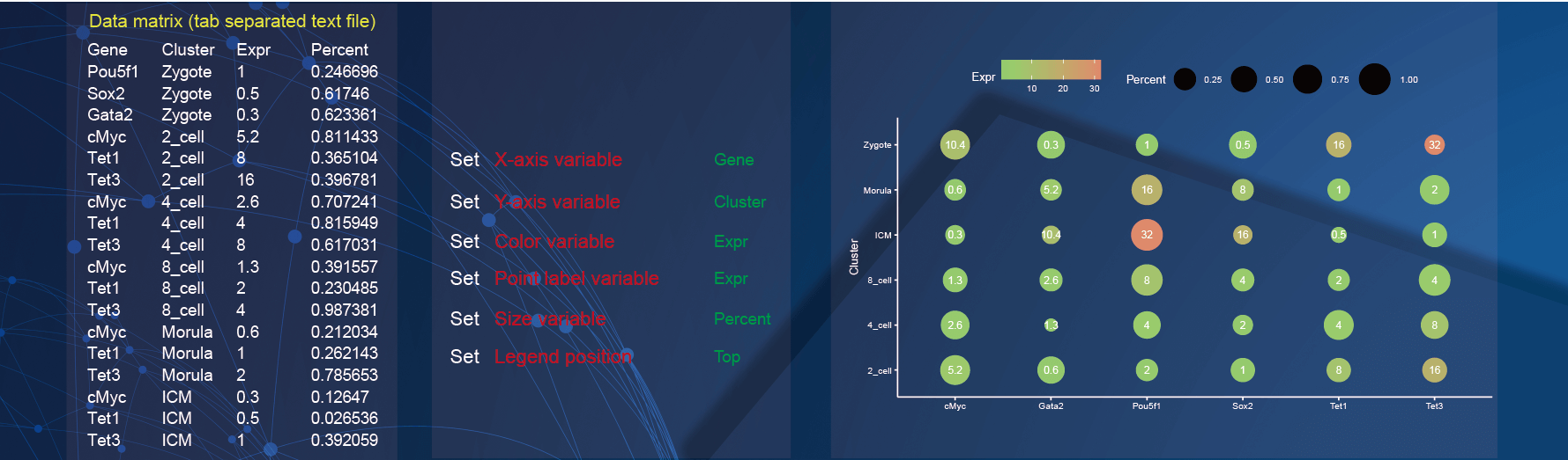
2.9 Scatter plot
In the demo1, paste four-column matrix with gene names, the sample information, gene expression, and gene percent.
Specify the x-axis to display gene by selecting the option of
Genein theX-axis variableparameter;Specify the y-axis to display the sample information by selecting the option of
Clusterin theY-axis variableparameter;Change the color of points to display the gene expression by selecting the option of
Exprin theColor variableparameter;Add the label of points to display the gene expression by selecting the option of
Exprin thePoint size variableparameter;Change the size of points to display the gene percent by selecting the option of
Percentin theSize variableparameter;The
Legend positionparameter is selected asTopto put the legend above the graph.
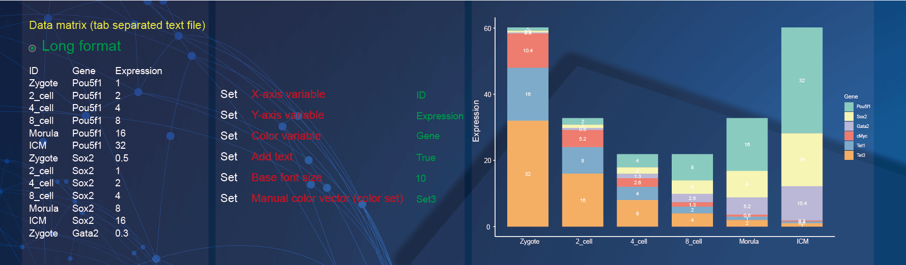
2.10 Bar plot
Both wide matrix and long matrix data can be used to draw bar plot. In the demo1, we used the gene expression table in different samples with long matrix format.
Specify the x-axis to display sample information by selecting the option of
IDin theX-axis variableparameter;Specify the y-axis to display the expression of genes in different samples by selecting the option of
Expressionin theY-axis variableparameter;Change the color of points to display the gene expression by selecting the option of
Genein theColor variableparameter;The
Add textparameter is selected asTrueso that the texts are added to bars to display the gene expressions;Change the font size by inputting
10in the textarea ofBase font sizeparameter;Use the color set “Set3” to color the bars by selecting the option of
Set3in theManual color vector (color set)parameter.
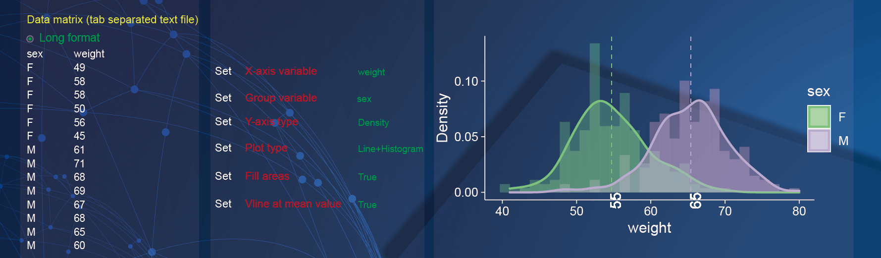
2.11 Histogram
Both wide matrix and long matrix data can be used to draw histogram. In the demo1, we used a data which is the weight in different genders with long matrix format.
In the drawing parameters:
Specify the x-axis to display weight by selecting the option of
weightin theX-axis variableparameter;Use the gender as group information by selecting the option of
sexin theGroup variableparameter;Specify the y-axis to display the density of weight by selecting the option of
Densityin theY-axis variableparameter;The graph is composed of histogram and density curve by selecting the option of
Line and Histogramin thePlot typeparameter;Fill areasparameter is selecting asTrueto fill the plot with colors;Vline at mean valueparameter is selecting asTrueto add vertical lines for each group.
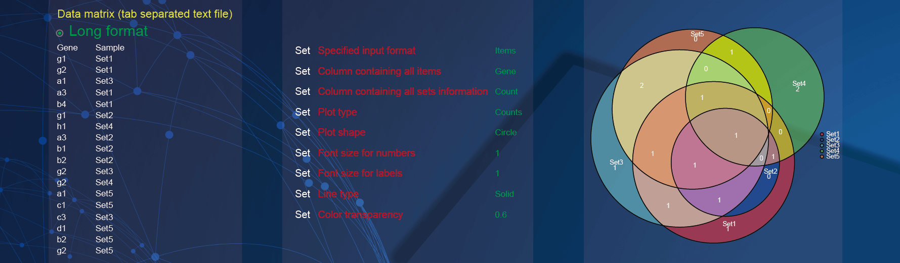
2.12 EulerDiagrams plot
In the demo1, paste two-column matrix with the sample information of genes.
In the drawing parameters:
The
Specified input formatparameter need to be selected asItemsdue to the need to count the number of genes in different sets;Specify the column containing genes by selecting the option of
Genein theColumn containing all itemsparameter;Specify the column containing sample information by selecting the option of
Samplein theColumn containing all sets informationparameter;Set
Plot typeparameter toCountsto add the number of genes in different sets;Set
Plot shapeparameter toCircleto make the graph corresponding to all groups circular;Change the font size for numbers by inputting
1in the textarea ofFont size for numbersparameter;Change the font size for labels by inputting
1in the textarea ofFont size for labelsparameter;Set
Line typeparameter toSoildto make the edge of the graph the solid lines;Change the color transparency of points by inputting
0.6in the textarea ofColor transparencyparameter.
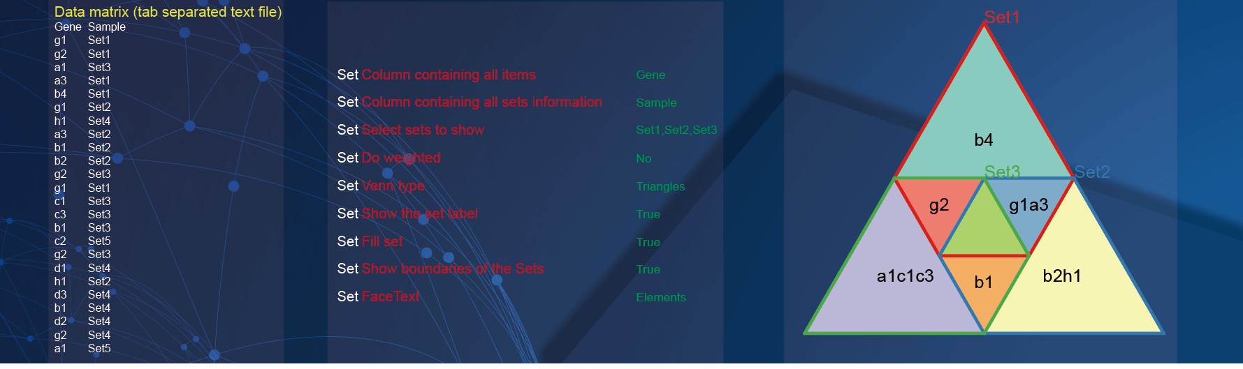
2.13 Non-classical venn
In the demo1, paste two-column matrix with the sample information of genes.
In the drawing parameters:
Specify the column containing genes by selecting the option of
Genein theColumn containing all itemsparameter;Specify the column containing sample information by selecting the option of
Samplein theColumn containing all sets informationparameter;Specify the interest samples to display by selecting the option of
Set1, Set2, Set3in theSelect sets to showparameter;The
Do weightedparameter is selected asNoso that do not calculate the weight of the data;The
Venn typeparameter is selected asTrianglesso that each set is displayed as a triangle and combined into a triangle;The
Show the set labelparameter is selected asTrueso that each set is displayed as a triangle and combines into a triangle;Add the sample name on the graph by selecting
Truein theShow the set labelparameter;Fill the sets with colors by selecting
Truein theFill setparameter;Add the sample boundaries on the graph by selecting
Truein theShow boundaries of the Setsparameter;Add the elements information of different sets on the graph by selecting
Elementsin theFaceTextparameter.